 Unblock
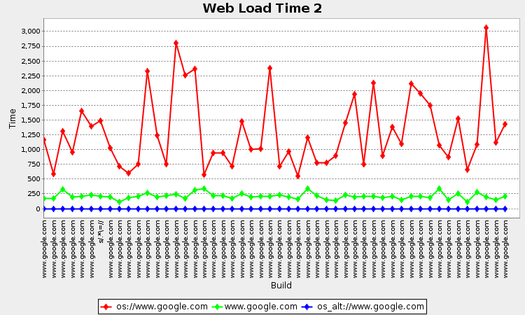
This chart shows a continuous snapshot of Unblock network performance. The green time series represents how long it takes a computer to fully load and render the google home directly, while the red series shows how long it takes while tunneled through the unblock service. Time is measured in milliseconds.
Rather than timing a single resource request, this is an integration test, which gives a better sense of how additional latencies in the system are reflected in real world experience.
New data points are added approximately every three minutes.